 What is a Histogram
A Histogram is a Quality Control Tool that graphically displays a data set.
More specifically, a Histogram is a type of Bar Chart that graphs the frequency of occurrence of continuous data, and will aid you in analyzing your data.
Why would you want to graphically display data?
Because as a Quality Engineer you probably already understand that every process, product or service has variation.
Which means that every piece of data that you collect will have variation in it, and this variation will exist in a “Pattern”.
And the best way to see or understand this Pattern of variation is to graph your data using a Histogram.
In that way, the pattern of the variation within the data will become obvious! More on Distributions below.
Difference between a Bar Chart & Histogram
I said above that the Histogram is a type of Bar Chart because they both use vertical bins to display data.
Yet there is a distinct difference between a Histogram and Bar Chart, and you need to know which one to use depending on the data analysis that you’re trying to perform.
A Histogram will group your data into Bins or Ranges while a bar chart displays discrete data by categories.
If your data is discrete or in Categories, then you should use a Bar chart instead of a Histogram.
Creating a Histogram
So – you’ve got some data and you’d like to create a Histogram to study the pattern of variation – Great!
Below are the 3 steps you must go through to create a powerful Histogram.
 Step 1 – Minimum Data Points
To accurately analyze a data set, it’s commonly recommended that you have at least 50 data points. Without an adequate amount of data, you cannot make reasonable conclusions about your data.
Basically you may miss the pattern in the variation.
On the flip side of this requirement, one of the strengths of the Histogram is that it allows you to easily analyze large data sets, so don’t feel shy about collecting or analyzing ALOT of data.
Step 2 – Number of Bins
Now that you’ve collected an adequate amount of data, it’s time to calculate the number of Bars, sometimes called Bins or Ranges, for your data set. The number of Bars for your Histogram will depend on the number of data points you collected.
Selecting the correct number of Bins is important as it can drastically affect the appearance of your data, which might lead you to the wrong conclusion.
Below is a table from The Quality Toolbox that you can reference when selecting the proper number of Bars. I also have to note that I’ve seen other people just take the Square Root of the total data size to get the number of Bins.
 Step 3 – Determine Bin Width
Once you’ve determined the number of Bins for your Histogram, it’s time to calculate the Width or Range of each individual Bin.
To do that you take the entire Range of the data (Max data point minus Min data point) and divide by the total number of Bins.
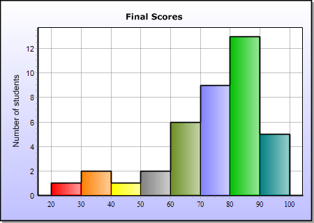
So for example, let’s say you’re creating a Histogram of Student’s Test Scores on an exam and the maximum score was 100 and the minimum score was 20; then your Range is 80(100 – 20).
Then you can divide your data Range (80), by the total number of Bins, lets say 8 in this instance. So the Width of each Bin is 80/ 8 = 10.
Similar to selecting the right number of total Bins, it’s important that you keep all the Bin widths the same or this will skew the distribution of the data.
Resources & Videos for Histogram Creation
Here’s a great resource from ASQ that will help you calculate the right number of Bins & the Width of each Bin for your Histogram.
Here’s an interesting Resource from Shodor.org. They put together an Interactive Histogram that shows you how a Histogram changes when you play with the Width or Interval of each Bin.
Here’s a good YouTube video that explains the basic method of constructing a Histogram by hand. It’s a bit slow for my taste, but it walks you (slowly) through the entire process!
Here’s another video from Khan Academy.com that walks you through the creation of a Histogram.
Create a Histogram in Excel
So, the above instructions are how to create a manual Histogram graph, which you must know and understand for the CQE Exam.
But who’s going to be creating a Histogram on paper now-a-days??? So I wanted to include a YouTube video on how to create a Histogram in Excel 2010. If you’re already using Excel 2013, I’ve added a separate link in the External Resources section below.
You should still understand the basics above regarding the correct number of Bins & Bin Width when using Excel.
Histogram Distributions
Now that you’ve created your histogram, it’s time to analyze the pattern of variation. To do this you must understand the different Distribution types & what they each imply about your process.
The 4 most common Distributions are:
- Normal Distribution
- Double-Peaked (Bi-Modal) Distribution
- Plateaued (Multimodal) Distribution
- Skewed Distribution
The Normal Distribution
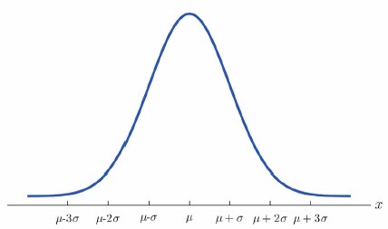
Below is an example of the Normal Distribution, in this distribution your data is evenly distributed and centered around your Mean value.
This type of distribution can often be interpreted that there is 1 primary source of variation that drives this distribution, however there can always be other smaller sources of variation that contribute to the total variation.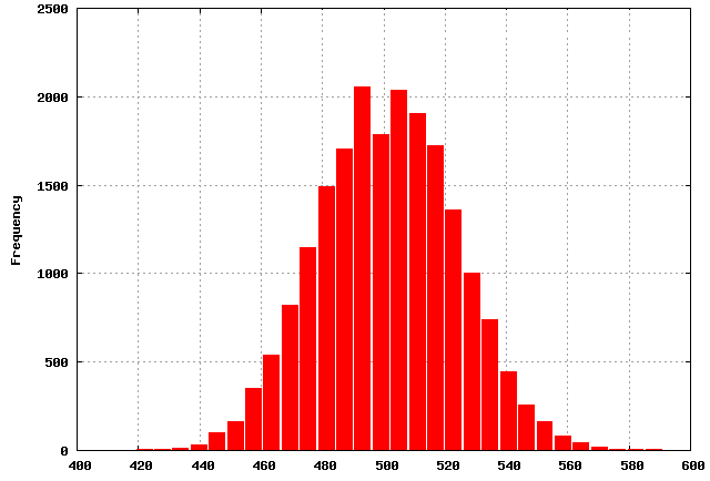
The Bi-Modal Distribution
Belwo is an example of the Bi-Modal Distribution. For Processes that display this distribution, it is normally understood that there are 2 independent sources of Variation that result in Peaks within the data.
Or, as in the data below, the data can reveal a shift in the process. Here’s an interesting article from StatCrunch.com about the Kentucky Derby. Spoiler alert, they shortened the race in the late 1800’s. 
Multi-Modal Distribution
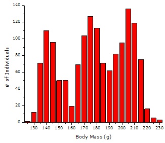
Below is an example of the Multi-Modal Distribution. When a process displays this pattern of variation it generally means that there are multiple sources of variation that are affecting the outcome.
Skewed Distribution
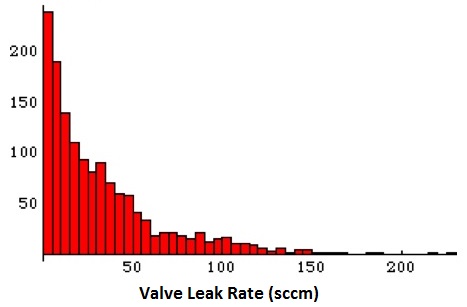
Below is an example of a Skewed Distribution. Skewed Distributions can be skewed in either the Left or Right direction.
A Skewed Distribution is normally the result of measurements or processes that have a natural limit.
For example if you were measuring the air leak on a valve, the natural limit would be zero. You can’t have a non-zero leak rate, and most of your data points (if your process was good) would be near zero. Then this leak rate might trail off to large, infrequent leak rates.
Here’s a good YouTube Video that walks through many of the Histogram Distributions and their common interpretations.
Power of a Histogram
As I said above, the Histogram is a powerful tool, so I wanted to provide you with some examples of the type of analysis you can perform with a Histogram.
Below I’ve covered 4 situations you may encounter where a Histogram would be very powerful (but you’re not limited too only these situations!):
- Determining the Pattern of Variation in support of Continuous Improvement
- Determining if a Product or Service is reliably hitting a Design Criteria
- Measuring a Process Improvement or Changes in a process
- Comparing the variation of two Similar Processes
Pattern of Variation & Continuous Improvement
The first Powerful feature of a Histogram, as I said above, is that it will allow you to see the pattern of variation within your data
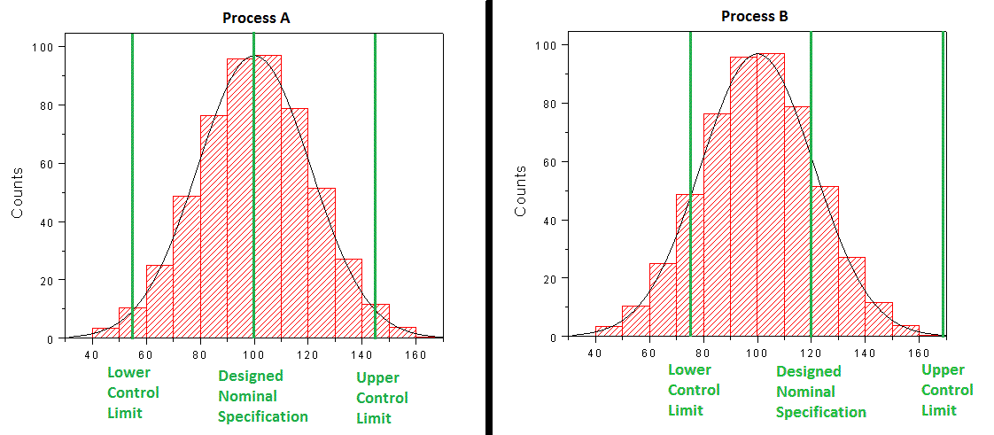
So let’s say that you’ve analyzed 2 different processes & created the histogram below. You’ve also added the upper control limit and lower control limit of the process and the nominal design dimension.
You’re Histogram has revealed that process A on the left is evenly centered around the Target Specification, but does produce an OOS (Out Of Specification) occasionally. Based on this data you now know that in order to reduce scrap (or OOS), you’ll need to eliminate Variation within your process.
A Histogram of Process B reveals that it is NOT centered around the Target Specification. In this situation your first improvement goal would be the Shift the Mean value to the right, then reduce Variation.
This analysis and the Histogram in general, sets the foundation for Process Capability Analysis.
Are You Reliably Meeting the Design Specification
The example above of the two side-by-side process can also be applied to the Process Design Phase of a new product. Similar to improving an existing process, you can use a Histogram to study a brand new process in order to determine if that process will be acceptable.
Measuring Process Improvements
Another powerful application of the Histogram is to measure if a process improvement was effective.
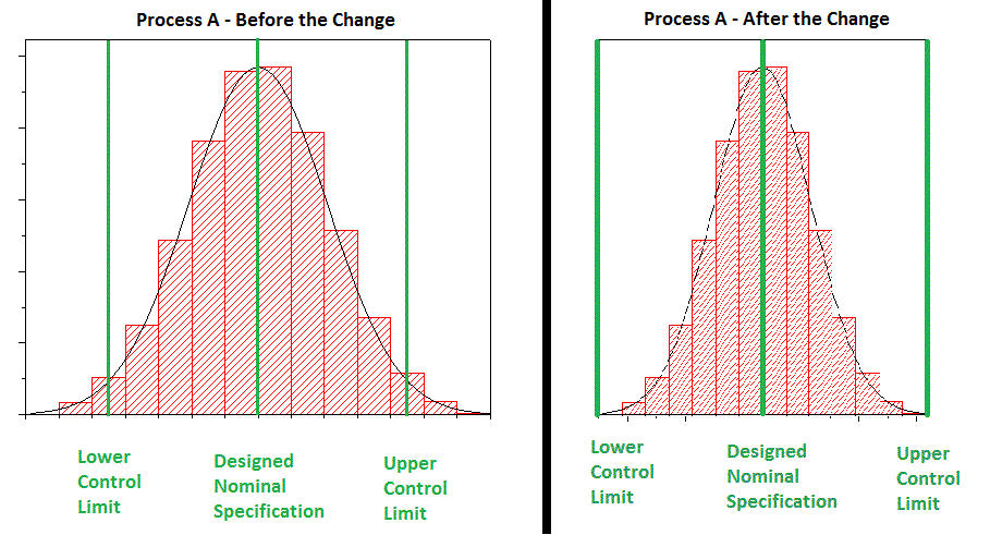
To continue the example above, let’s say you took your baseline data from Process A and decided that you needed to eliminate variation. Then you went back to your process and made some adjustments and took a new set of data after the adjustments and saw the following data set.
With this piece of analysis, you can confirm that your adjustments were successful!
Comparing the Variation of 2 Similar Processes
Sometime you’ll have two similar processes, perhaps it’s two identical assembly lines. These two processes can be made up of similar pieces of equipment and follow the same procedure. Do you expect them to be identical?
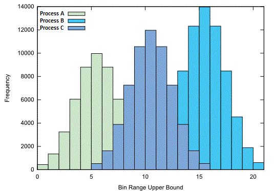
You can use a Histogram to easily & accurately compare these two processes together. For any processes that you’re analyzing, you can over-lay the resulting Histograms onto the same graph, similar to below..
In this way, you can visually compare the Mean, Range, Deviation & Pattern of Variation within each data set.
Sometimes when you compare two data sets together using a Histogram, you may notice that one process has more data points making it difficult to compare the two processes.
To eliminate this, your data sets should be “Normalized”. By that I mean, divide the data in each set by it’s own volume to convert Frequency in Percentage. In doing this, 2 data sets can be accurately compared to each other.
Downsides to the Histogram
While the Histogram is a powerful tool, it also has its limitations.
The first downside is the 50 minimum data points required for adequate analysis. This is bad for measurements which are destructive or for products which are built infrequently.
Another downside is that a Histogram is not powerful enough to allow for definitive conclusions regarding small differences in distribution peak locations.
Lastly, the Histogram never reveals the source of the variation. You must pair up your histogram with direct observations from your process to draw appropriate conclusions about the source of your variation.
