 The Scatter Plot is one of the seven QC Tools that you, the Quality Engineer, must know and be able to use when analyzing your data.
The Scatter Plot is a mathematical diagram that plots pairs of data on an X-Y graph in order to reveal the relationship between the data sets.
Scatter Plots require 2 sets of data, the first set of data is normally referred to as the Independent Variable (X) with the second data set typically being your observed measurement also known as the Dependent Variable (Y).
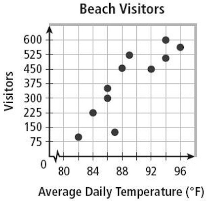
In the example on the right, temperature is plotted on the X axis as the independent variable because it cannot be controlled, while the dependent variable, beach visitors, is plotted on the Y Axis as it can be thought of as the “result” or “observed” measurement.
Get it?
By analyzing this data with a Scatter Plot, you can now firmly conclude that yes, the data indicates that there is a relationship between the Temperature outside and the number of visitors to the beach.
You can’t necessarily say that Temperature “causes” beach visitors, but the 2 sets of data to correlate. More on this later.
The Scatter Plot can also commonly be referred to as a Scatter Chart, Scatter Graph, an XY Scatter or a Scatter Diagram.
Correlation & Interpreting Your Scatter Plot
In the example above, the Independent and Dependent Variables are fairly obvious. However you may often find yourself in a situation where you cannot determine which variable is the dependent one (Y) and which is independent (X).
In this case, you can still plot the data on whichever axis you choose, however the relationship that reveals itself on the graph can only be thought of as a Correlation, not Causation.
Correlation & Causation, What’s the difference
So what is Correlation. . . . Correlation is defined as a relation existing between variables which tend to occur together in a way not expected on the basis of chance alone. A Scatter Plot, by itself only displays the relationship between variables.
It can not prove that one variable causes the other.
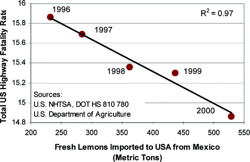
This graph is hilarious!
It shows a correlation between US Highway Fatality Rate and the number of fresh lemons imported into the US from Mexico. This graph is the perfect example of 2 variables that correlation, but share no “Causal” relationship at all.
Hence the phrase, “Correlation does not imply Causation” which means that the correlation revealed in your Scatter plot cannot be used to infer a causal relationship between the variables you’ve plotted.
On the other side of that coin, this phrase should not be taken to mean that correlations cannot indicate the potential existence of causal relations.
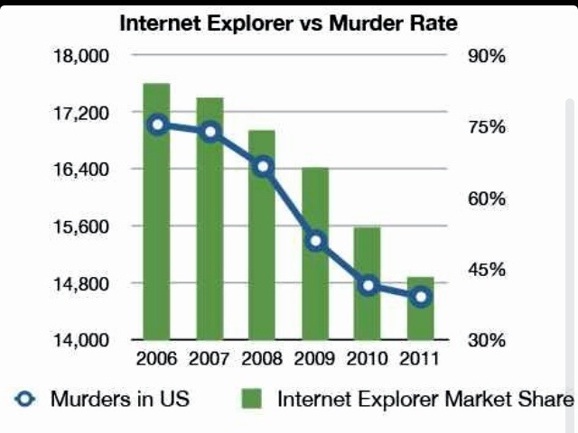
(Wikipedia: Correlation v. Causation) Here’s another hilarious graph that shows a clear Correlation (relationship) between the U.S. Murder Rate and the Usage of Internet Explorer. Hopefully it’s now completely obvious that Correlation does not imply Causation.
Correlation Types
Back on topic now, another topic that you’ll need to understand are the different types of correlation.
Below are the 3 Correlation types that can be observed; Positive, Negative & No Correlation.
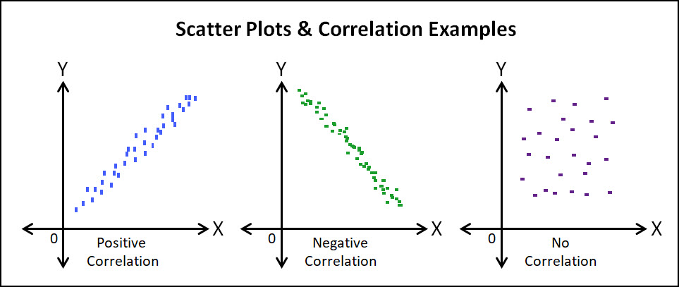
This is fairly self-explanatory, in a Positive Correlation, when one variable increases, a positive increase can be expected from the second variable.
The opposite is true for the Negative correlation, when one variable increases, the other variable can be expected to decrease.
No Correlation results when the two variables have no measurable effect on each other. That is a change in X, does not impact Y.
Line of Best Fit & The Strength of Correlation (R)
When analyzing a Scatter Plot It is often helpful to add what is called the Line of Best Fit in order to visualize the strength of your correlation.
The slope of this line will also confirm if the correlation is positive or negative. The strength of your correlation is NOT the slope of the line, it is how close the points are to the Line of Best Fit.
In the example below, both Plots share the same Line of Best Fit, however the data points on the right hand side of the graph are much closer to the trend line. This indicates that the level of correlation between the two variables is much stronger than the data on the left.
A Low Correlation can also be interpreted to mean that there are likely other variables or factors that contribute to your “Observed” or Dependent Variable.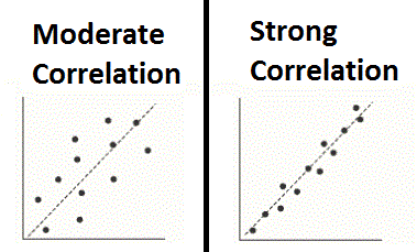
Pearson’s Linear Correlation Coefficient (R)
Below are a few other Degrees or Strengths of Correlation and how those graphs might appear. Along with these graphs you can also see the R Value associated with each plot.
The R Value, which is also called Pearson’s Correlation Coefficient is a measure of the strength and direction of the linear relationship between two variables. R Values range from +1 to -1, with +1 being a perfect positive correlation, -1 being a perfectly negative correlation and 0 being absolutely no measurable correlation.

The Pearson correlation coefficient (R) is an indicator of the strength of a linear relationship between two variables, however its value generally does not completely characterize their relationship.
I keep italicizing the word linear because it’s important to recognize that this R value is only valid if your data is approximately linear. What I mean by this can be seen below in these 4 graphs called the Anscombe’s quartet.
In each of these graphs, the Line of Best Fit and R Values are all the same, however in 3 of the 4 cases the data can obviously be interpreted as non-linear. 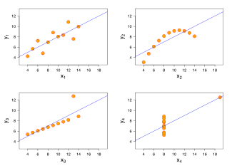 Therefore your Pearson’s Correlation Coefficient must only be thought of as a “Summary Statistic” as it does not fully define a relationship and you must always be evaluating your data graphically to confirm a linear relationship before trusting your R value.
 The Difference between R & R2
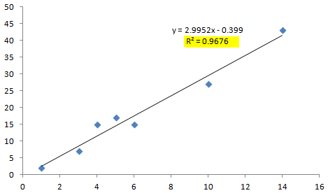
If you’re like most engineers, you’ll be creating your scatter plot in excel. What’s nice about excel is that you can easily get excel to show you the R2 value and you may be wondering what’s the difference between R & R2.
R = The Correlation Coefficient
R2 = The Coefficient of Determination
So What is R2 and what does it represent?
R2 represents the % of the total variation in y, that can be explained by the linear relationship between x & y.
Let’s say you measure r and it turns out to be 0.866. Then you calculate R2 = 0.75 by just squaring your R value. You can then interpret your data to mean that 75% of the total variation in y can be explained by the linear relationship between x & y.
The other 25% of the total variation in y remains unexplained. If you’re interested in learning more about doing regression analysis within excel, here’s a YouTube video that does a decent job of explaining it.
Manual Relationship Analysis for Scatter Plots
There’s one last topic that we need to discuss and that is the process for manually determining if a correlation (not causation, remember) exists within your data.
I’m going to be short with this and say that I’ve never done this analysis as I’ve always had excel to help me analyze my data, but it’s probably something you should at least be familiar with doing. Here’s the link to the ASQ page on Scatter Plots to help you walk you through this analysis.
Scatter Plot Template
I also wanted to provide you with a link to ASQ’s Excel Spreadsheet for Scatter Plots.
Quite frankly I’m disappointed that this spreadsheet is geared more towards the manual calculation and does not include any Regression information.
References & Online Links
- The Quality Toolbox
– Nancy Tague
- https://www.khanacademy.org/math/probability/regression
- http://asq.org/learn-about-
quality/cause-analysis-tools/ overview/scatter.html - http://en.m.wikipedia.org/
wiki/Scatter_plot - http://mste.illinois.edu/
courses/ci330ms/youtsey/ scatterinfo.html - http://en.wikipedia.org/wiki/Correlation_and_dependence
- http://en.wikipedia.org/wiki/Anscombe%27s_quartet
- http://en.wikipedia.org/wiki/Correlation_does_not_imply_causation