 “The ultimate purpose of collecting data is to provide a basis for action” – W. Edwards Deming
Deming is highlighting the purpose & benefit of data – to improve our decision making and ultimately the results we can achieve.
Before you can harness the full power of data, you must have a strong understanding of how data is collected and summarized.
This chapter is actually the 2nd part of a two part series associated with the collection & summarizing of data.
Part 1 is all about the different types of data, measurement scales, data collection methods & data integrity/accuracy.
This 2nd part is dedicated to the following 4 topics which is more associated with the summarization of data.
- Descriptive statistics – Describe, calculate, and interpret measures of central tendency and dispersion (central limit theorem), and construct and interpret frequency distributions.
- Intro to Inferential Statistics – Distinguish between descriptive and inferential statistics. Assess the validity of statistical conclusions by analyzing the assumptions used and the robustness of the technique used.
- Graphical methods for depicting relationships – Construct, apply, and interpret diagrams and charts such as stem-and-leaf plots, box-and-whisker plots, etc.
- Graphical methods for depicting distributions – Construct, apply, and interpret diagrams such as normal and non-normal probability plots.
Next to each topic is a description of what you must know (the Learning Objectives) for that topic.
Within these four areas we will discuss the difference between populations & samples; along with the relationship of descriptive statistics to inferential statistics.
Understanding these topics is foundational for all of the remaining chapters within the statistics pillar, so pay attention!
Descriptive & Inferential Statistics
Within the field of statistics there are two main branches worth noting, Descriptive Statistics & Inferential Statistics.
Inferential (Analytical) statistics are a group of methods & tools that allow you to extrapolate (or infer) conclusions beyond your simple data set.
This includes things like hypothesis testing (T-test), Regression Analysis, ANOVA, etc.
The methods of Inferential statistics are often more complex than Descriptive Statistics; however they rely on Descriptive Statistics as their foundation.
For example, before you can perform a hypothesis test on a given data set you must describe that sample data set to understand the mean, standard deviation or other characteristics – which is descriptive statistics.
Descriptive (Enumerative) statistics is the process of describing, summarizing & displaying the basic features, properties or characteristics of a given data set.
The purpose of descriptive statistics is to analyze data is such a way as to facilitate the understanding of that data and to support the Inferential statistics methods.
Whenever you’re describing a set of data, there are two key concepts that are almost universal – central tendency & dispersion.
These are both perfect examples of descriptive statistics, which include the mean, median, mode, range, variance, etc.
Descriptive Statistics is often described as the first step in the analysis process; which is often followed by inferential statistics.
Now let’s quickly discuss two other important topics within Inferential Statistics – Assumptions & Robustness.
Assumptions with Inferential Statistics
Within inferential statistics (think T-Tests, ANOVA, Correlation Analysis) we’re making inferences about a population based on a sample data.
Anytime we use one of these inferential statistics tools the accuracy or validity of our results are dependent on our ability to meet the assumptions associated with that tool.
For example, many inferential tools & methods are based on the assumption of normality.
We assume that the population being sampled from is normally distributed for our conclusion to be accurate.
As our actual distribution deviates from this assumption, then our conclusions accrue some measure of inaccuracy.
Another typical assumption is the one we make about the equality (or homogeneity) of variances.
This is the assumption we make about our various sampling groups and we assume that each sample groups has the same variance within the groups.
This assumption about variances is an important one when we’re assessment mean differences (T-Test, ANOVA).
Another common assumption we make, especially during regression analysis is the assumption of Linearity which is the assumption that the relationship between our Independent & dependent variables is linear.
If this assumption of linearity is not met, then our inferences or predictions may be incorrect.
The last assumption to talk about it the assumption of random sampling.
Many statistical methods are based on the assumption that your sample data was randomly selected from the population.
If your sampling was not random (and thus this assumption is not met), it can introduce bias or error into your sample & impact the validity of your results.
Within this section it’s important to familiarize yourself with the various assumptions.
However we will review these when we get into detail into each of those inferential tests mentioned above.
Lastly – The most important thing to remember here is to always test your assumptions!
Awareness of your assumptions is not enough – to ensure your conclusions are accurate it is important to test your assumptions.
If your assumptions are wrong, your conclusion might be wrong.
Robustness in Inferential Statistics
The other major topic surrounding Inferential statistics is the concept of Robustness.
There are two sub-concepts within Robustness that we will discuss quickly – these are Robust Statistics & Robust Tests.
Robust Tests are those inferential statistics tools that will still provide accurate results even if one or more of the tests underlying assumptions are not met.
In general, the robustness of the test is dependent the level of tolerable deviation from the tests underlying assumptions.
Said differently, certain inferential methods are still valid when minor deviations from the underlying assumption are present. However major deviations from these assumptions can result in inaccurate conclusions being made.
A common example of a Robust Test is ANOVA, which is predicated on the underlying assumption of Normality.
Oftentimes, the results of ANOVA analysis are still valid even if the underlying population is not perfectly normally distributed.
Control Charts are another example of a Robust Test in that they are also relatively insensitive to the assumption of Normality, making them Robust.
Robust Statistics are statistics that are resistant to outliers.
The common example for robust statistics is the difference between the Mean & the Median.
Spoiler alert – we will near below that the Mean value is susceptible to outliers – therefore it’s not very robust.
On the flip side, the Median value is not very susceptible to outliers and is considered a more robust statistic.
Similarly, the Range of a data set is considered a non-robust statistic in that it is greatly affected by outliers, and thus not considered very robust.
This concept of Robustness is an important one to keep in mind as your performing both descriptive statistics & inferential statistics.
Descriptive Statistics
Ok – let’s jump back into the Descriptive Statistics.
We will start with Central Tendency (Mean, Median & Mode) & then move on to Dispersion (Range, Variance & Standard Deviation).
From here we will move on to a more advanced topic – the central limit theorem – which is a key concept that lays the foundation for much of the statistical analysis used throughout Quality.
Finally, we will wrap up with a quick introduction to the idea of frequency distributions & the shape of distribution which again are foundational concept within statistics.
Central Tendency
The Central Tendency is a statistic that represents in some way, the central value of a data set.
The Mean, Median & Mode are the three common measures of central tendency which we will discuss here.
The Mean Value
The mean value is the arithmetic average, which is calculated as the sum of all observations divided by the total number of observations. Let’s see what this looks like if we wanted to calculate the mean value of the following 3 observations: 1.1, 1.2, 1.3
 Anytime you see that Greek Symbol Sigma (Σ) it means sum.
Let’s look at some common examples of summations throughout statistics using the following 3 data points: 2, 5, 7 So the sum of all x values within this data set is 14.
 So the sum of the squared values within this data set is 78.
 This is known as the square of sums, and it is the square value of the summation of the data set.
That was a little side-topic, but it’s something that’s good to understand now, before the calculations get any crazier.
Now back to the topic of mean values.
Sample Mean v. Population Mean
Later in this chapter we will discuss the difference between a population and a sample, but before that I wanted to show you the calculations for the sample mean & population mean.
The equations & calculations are the same but there is a difference in the symbols used for each, and you must know these.
The sample mean is called x-bar and it’s calculated as the sum of all observations within the sample divided by the sample size (total number of observations within the sample). Within statistics, the lower case letter n generally denotes the number of observations within a sample.
As we move over to the population below, you’ll see we use the upper case N to represent to total size of the population.
The population mean is represented by the greek letter μ (called mu) and it’s calculated as the sum of all observations within the population divided by the population size Remember, the actual mathematics behind each of these calculations is identical.
The only thing that changes is the symbols used to represent the sample parameters or the population parameters.
The Median Value
Alright, imagine you wanted to know the average home price in your local neighborhood, so you take a sample and get the following data set of 5 home prices:
197K, 230K, 185K, 252K, 1,400K
Remember now that all of these home prices are in Thousands, so the first price is $197,000, while the last home is $1,400,000.
So we take the sample mean of this data set and get an average home price of: If you compare that mean value against the original data set, you’ll find that the sample mean (452.8K) is higher than 4 of the 5 points within the data set.
So it seems odd to report the average home price in your neighborhood as 452.8K, right?
It’s because the home that’s worth 1.4 Million skews the average upward.
This is there the Median value can be a powerful measure of Central Tendency.
The Median value becomes a more accurate reflection of the central tendency when you’re dealing with data that tends to have naturally occurring extreme values, or if your data set has outliers (non-naturally occurring extreme values).
This includes data sets like home prices, or job salaries.
Before we move on I guess I should actually formally define the Median value for you.
The Median Value represents the middle value in a data set.
Literally, the median is the middle value, that’s it.
So if we take our previous example: 197K, 230K, 185K, 252K, 1,400K
and we arrange the data in numerical order (Lowest to Highest): 185K, 197K, 230K, 252K, 1,400K
and we start by eliminating values on the outside and work our way in, we find that the median value is 230K.![]() Now, one question you might ask yourself is, what happens to the median value if you have an even number of data points.
Now, one question you might ask yourself is, what happens to the median value if you have an even number of data points.
So let’s modify the previous example, to the following data set, and I’ll show you what to do.
![]() Ok, so we start by eliminating values on the outside, and then for the middle two values we take the average.
Ok, so we start by eliminating values on the outside, and then for the middle two values we take the average. So in this example, the Median Value, which is often represented by the Upper Case M is 213.5K.
Now remember, the median value is the middle value.
So 50% of the data will be more than the median, and 50% of the data will by less than the median.
The Mode
Ok, on to the final measure of central tendency, the Mode which is defined as the most frequently occurring value in a data set.
Take for example the following data set: 0, 2, 2, 1, 3, -1, -2, 3, 1, 2, 2, 0, -1
If we arrange this data in order we get: -2, -1, -1, 0, 0, 1, 1, 2, 2, 2, 2, 3, 3
We can then analyze this data set to determine that the most frequently occurring value is 2, which shows up in the data 4x times.
This is the mode of the data set.
Based on this definition, you should know that it is possible to have multiple mode values within a given data set.
When dealing with sample data, the mode is often represented as ![]() .
.
When dealing with population data, the mode is often represented as ![]() .
.
That’s basically it for the idea of Central Tendency & it’s 3 common measures (Mean, Median & Mode).
Dispersion (Variation)
Dispersion, which is also known as Variation, is a reflection of the spread (scatter) or dispersion of data around the central tendency.
The graph below shows the concept of variation.
All 4 curves in this graph have the same mean value (central tendency), but they all have different variations. That is, their data is spread out differently around the mean value.
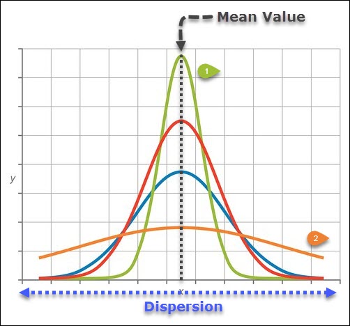
The first curve in green, has a much higher peak due to the fact that more of the data within this data set tends to lie near the mean value, thus the variation is less than the other curves.
The second curve in orange, has a much lower peak (at the mean value) and the data is more disperse or spread out than the first curve, thus this curve has more variation or more spread than the other curves.
This is why when we’re describing data (descriptive statistics) we need to know both the mean value & the variation so that we can fully describe the behavior of the data.
Range, Variance & Standard Deviation are the three common measures of variability that we will cover here, starting with the easiest – The Range.
The Range
The Range value is the simplest measure of dispersion within a data set.
Range is defined as the smallest interval containing all of the data.
The range of a given data set, whether it’s a sample or a population, is simply the maximum value minus the minimum value.
 Let’s see what this looks like with the following data set of test scores:

When interpreting your Range results, the smaller the range value, the smaller the dispersion of data around the central tendency, and vice-a-versa (if your Range value is big, then dispersion is big).
The challenge with using the Range value as a measure of dispersion is that it can be very sensitive to outliers.
Variance
Alright, lets switch gears to the next measure of dispersion – Variance.
From the mathematic perspective, variance represents the average squared difference of each individual value from the mean.
Here’s what the equation looks like for the variance of a sample: Notice here that we’re talking about a sample not a population, which has an impact on the way variance is calculated.
I’ve highlighted the differences between the two in red, and you must know that when you’re calculating the variance of the population (shown below), the equation changes slightly. So with the sample variance we’re comparing observations against the sample mean –
![]()
When we’re dealing with the population variance, we’re comparing observations against the population mean – ![]()
We make a similar change with the bottom half of equation which becomes the population mean (N) when calculating the population variance and is n-1 when calculating the sample variance.
To fully explain the difference between these two equations involves some advanced statistics, so we won’t go into why these two are different.
The simplest way to explain this difference is that your sample data will always tend to underestimate the actual population variance, so to more appropriately estimate the population variation the equation is adjusted.
Standard Deviation
One particular problem with variance is the units of measure.
If you analyze the equation above, we’re squaring (2)the difference between each observation and the mean value.
This means the resulting value has the squared units of your original observation.
So if you’re measuring your observations with a units of measure of centimeters (cm), then the units of the variance measurement ends up at cm2.
This is a problem in math where we like to perform mathematical operations on values that contain the same units.
This is where Standard Deviation comes in – it is the square root of the variance.

You’ll notice that we use a different parameter for each of these equations. The Sample standard deviation is called s, while the population standard deviation is called sigma ( ).
Example Calculation for Sample Variance
Let’s walk through an example calculation for Sample Variance & Sample Standard Deviation using the following data set: We can start by finding the mean value of these measurements:
 So now we can calculate variance & standard deviation – let’s do this using a table:
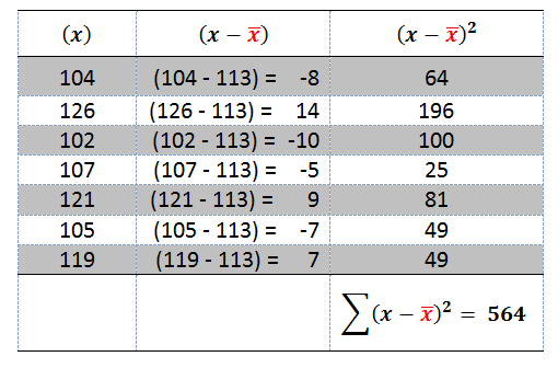
Notice in this table the left hand column is the individual measurement values (X).
Then in the middle column we calculate the deviation of each observation from the average value.
This deviation from the mean is then squared in the 3rd column so that we can ultimately sum up that squared deviation.
Now we can calculate the Sample Standard Deviation:
Alternate Calculation for Variance
Ok, so there’s another calculation for Variance & Standard Deviation that we should talk about.
This calculation is called the computational formula.
This calculation is an alternate to the one we discussed above, and which I’ve shown again here, which is known as the definitional formula: This new computational Formula looks like this:
 I know the new calculation looks more complicated, but as you get experience with it, you’ll find that it’s actually easier to use.
Let’s do an example using the same data set as above. So let’s start breaking this formula down into its individual components:
 Then we can calculate the sample standard deviation.
 Populations & Samples
Alright, on to the next topic which is Populations & Samples.
Within this section we will discuss the key differences between populations & samples as well as their relationship to inferential statistics & descriptive statistics.
Lastly, we will also discuss the concepts of a statistic & a parameter.
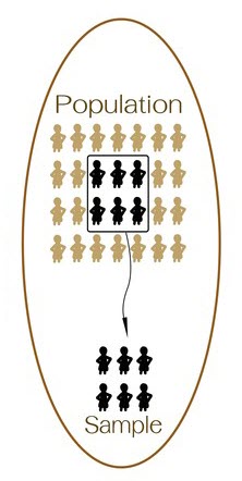
Within statistics, a population is defined as a total set of objects, events or observations about which you want to study.
For example, if you wish to study the attitudes of the employees within your company that has 100,000 team member, then the population would be all 100,000 employees.
It would be very difficult & impracticable to collect feedback from every single person on the team, which is where sampling becomes a powerful tool.
A Sample is defined as a unique subset of a population.
This is where we can highlight the relationship between Descriptive Statistics & Inferential Statistics.
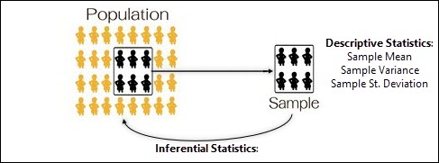
Oftentimes after sampling we will use our descriptive statistics tools (Mean/Variance/St. Deviation) to characterize the sample that was taken.
Then, after characterizing the simple, we will turn around and use an Inferential Statistic tool (hypothesis testing, etc) to make inferences about the population that was just sampled from. Make sense?
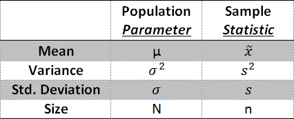
Let’s change gears real quick and discuss the difference between a Statistic & a Parameter.
When we talking about sample data and we calculate the mean or standard deviation, we are calculating a Statistic. Statistics are associated with samples.
When we’re talking about the entire population – the population mean or population standard deviation, we’re talking about a Parameter.
Central Limit Theorem
Next up is an important concept within statistics – the Central Limit Theorem.
This Theorem states that the distribution of sample means taken from the same population will be normally distributed (or nearly normal).
This theorem is true even if your sampling from a distribution that is not normally distributed.
This Theorem is important because it allows us to use the statistical tools that only work for normal distributions to solve other problems when the original distribution is not normal.
While this theorem does not require that you’re sampling from a normal distribution, it does required that you’ve sampled a sufficiently large number of samples from the original population.
In this situation where you’re sampling from a population, the mean of the sample means will approximately equal the population mean, and the variance associated with the sample means will nearly approximate the population variance.
As a general rule, sample sizes equal to or greater than 30 are considered sufficient for the central limit theorem to hold, meaning the distribution of the sample means is fairly normally distributed.
A simple example of the Central Limit Theorem is the idea of a coin flip.
Let’s say you flip a coin 10 times and count the number of times that heads comes up in the flip – in general this sample of flips should usually result in 50% (or 5 out of 10) of the flips coming up as heads.
Now remember, the original distribution associated with a coin flip is Uniform – the coin will either be heads or tails.
However when we sample from this distribution, the probability of getting a given number of heads should follow a normally distributed curve, where the mean value is equal to 50%.
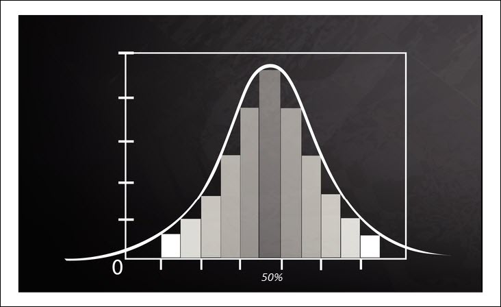
In this experiment you would not be surprised if you flipped a coin 10 times and you only got 4 heads, or 6 heads, or even 7 heads.
However, on average, these samples would have a mean value of 5 heads (50%) and this sample distribution would be normally distributed around that mean value of 50%.
This can be seen in the distribution above.
Frequency Distributions
This gets us to the next topic of frequency distributions.
A frequency distribution is a method for analyzing a data set to determine the frequency at which different observations occur.
In this section I’m going to show you how to construct & interpret a frequency distribution.
Let’s say for example, you wish to know how many times within a given day you’re interrupted. So you collect data for a month documenting the number of times you’re interrupted:

These 30 data points are called your observations, and they range from zero (0) interruptions per day all the way up to four (4) interruptions per day.
Now we can analyze the frequency at which these observations have occurred using the following table:
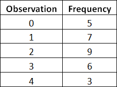
So on the left hand column there is a list of the different observations made, from zero interruptions to four interruptions.
Then in the right hand column I’ve counted the frequency at which that observation has occurred.
So if we go back to the original data set, you can see that zero interruptions happened 5 times, and two interruptions occurred 9 times within the data set.
![]()
Have you ever heard that a picture is worth a thousand words – well, you can see these results graphically below.
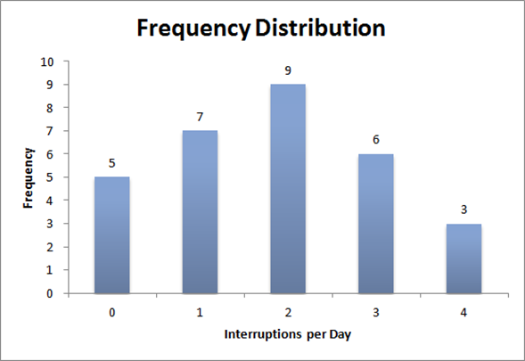
This graph immediately helps us to understand and analyze our data – and we can immediately get a good feel for the central tendency & spread (variation) associated with our data.
Distribution Shapes
One other concept to quickly touch on now is the shape of frequency distributions and its relationship to Central Tendency.
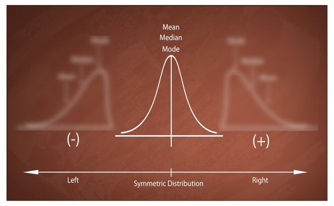
So for example, as you can see below, when your working with data that is normally distributed, your mean is equal to your median & mode.
When we discussed the median value above we talked about skewed data.
Below you can see what happens to the Mode, Median & Mean value when a data set becomes skewed.
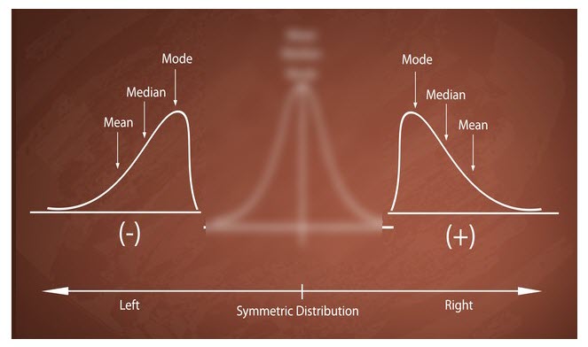
The mode is unaffected by the addition of outliers because it simply represents the most frequently occurring value, while the mean value is the most affected by outliers and is pulled in the direction of the skew.
When the tail of the distribution extends out to the left (image on the left) this is called a negative skew.
In the image on the right, the tail of the distribution extends out to the right, this is known as a positive skew.
There are two other common distribution types, Bimodal and Exponential which will be covered in future chapters.
Graphical Methods for Depicting Relationships
Alright, on to the final two sections of this chapter which include graphical methods for depicting relationship, and graphical methods for depicting distributions.
In this first section, graphical methods for depicting relationships, we will cover two specific methods, the Stem & Leaf Plots and the Box & Whisker Plots.
Both of these methods will allow you to graphically analyze data to understand the central tendency & dispersion associated with a given set of data.
Within this section I will show you how to construct, apply, and interpret these two tools starting with the Stem & Leaf Plot.
Stem & Leaf Plot
Let’s say you’re a teach and you’ve got a class of 44 student who have recently taken a test, and below are their scores arranged from highest to lowest.

This ordered data can then be converted into a stem and leaf plot. The stem & leaf plot has two halves.
The first half is the Stem (shown in blue below) , which in this scenario, is the Ten’s place of the exam score. So the lowest score was a 19, and the Stem value for 19 is 1.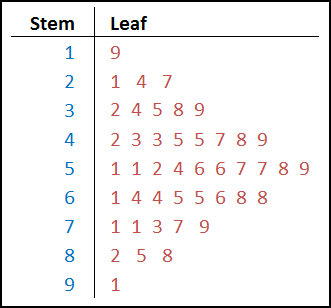
You’ll notice in the raw scores above there were 2 scores in the 20’s (21, 24 & 27).
This gets translated on the stem & leaf plots as 2 | 1 4 7.
This stem & leaf tool is a type of histogram, and one of the few types of histograms that displays actual data points (numbers) instead of bars.
Box & Whisker
Alright – now on to the Box & Whisker Plot, which is a similar tool to the Stem & Leaf Plot in that its primary goal is to assist you in recognizing patterns & relationships within the data set that you’re analyzing.
This tool is especially useful when comparing two or more sets of data against one another.
Similar to the Stem & Leaf Plot we will cover the construction, application & interpretation of data using this tool.
Below is a Box & Whiskey Plot (box plot) that is labeled all of the must-know concepts associated with this tool.

Median (Q2) – The first must know concept is the Median, which is sometimes referred to as Q2.
This is reflected on the Box Plot as the centerline of the data.
Remember the median value is simply the middle value – so 50% of the data falls above it, and 50% falls below it.
Lower Quartile (Q1) – The lower quartile is the 25% mark.
It is simply the median value of the lower half of the data set.
It’s called a quartile because a quarter of the data falls below it, and a quarter of the data falls above it.
Upper Quartile (Q3) – The upper quartile is the 75% mark and it is simply the median value of the upper half of the data set.
Inter Quartile Range (IQR) – The inter quartile range is simply calculated as Q3 – Q1 and it represents the width of the box.
Whiskers – The whiskers represent the bottom 25% of the data and the top 75% of the data and they terminate at the maximum & minimum values within your data set.
These whiskers can definitely be skewed by outliers within your data set, so watch out.
To adjust for this, some statistical software programs simply calculate the whisker length as a multiple (1.5x) of the IQR (Inter Quartile Range).
So if your IQR is 10, then your whisker length would be 15 (10 x 1.5).
Box & Whisker Plot Example
Let’s again say you’ve analyzing exam scores and you want to create a box and whisker plot.

Once the exam scores are put into order from highest to lowest, the median value (Q2) can quickly be spotted as 73. This is the centerline of your box plot.
The lower quartile (Q1)can then be assessed as the median of the bottom half of the data et (65 – 71) which is the average of 68 & 68.
The upper quartile (Q3)can then be assessed as the median of the top half of the data set (77 – 91). Similarly as above, the upper quartile is calculated as the average of 82 & 85, which is 83.5.
Then your inner quartile range can be calculated as 83.5 – 68, which is 15.5.
Then the whiskers terminate at the maximum & minimum values of the data set (91 & 65).

Note – this box plot is not to scale, I’m simply showing it here so you see how the upper quartile, median lower quartile and whiskers end up on the box plot.
Graphical Methods for Depicting Distributions
Alright – last section! This one’s all about the graphical methods for depicting distributions.
Specifically we will talk about how to construct, apply, and interpret diagrams such as normal and non-normal probability plots.
A Probability Plot is a tool to determine if a data set follows a particular distribution.
The most common distribution that Quality Engineers are attempting to confirm within their data sets is the Normal Distribution.
A number of statistical tools (Process Capability, etc) require data to be normally distributed, so the probability plot is normally created prior to the process capability analysis to confirm normality.
The other distributions that are considered in probability plotting include the weibull distribution which is big in Reliability Engineering, the exponential distribution, Lognormal, bimodal distribution and others.
Ok, so full disclosure, I highly doubt that you’ll ever have to construct a probability plot on a CQE Exam. . . and most statistical programs do it for you in the snap of your fingers.
Having said that. . . I’m going to show you a quick example of how a probability plot is constructed so that you know what’s going on in the background.
This example will show you the process of a probability plot where a normal distribution is the desired outcome.
Let’s take the exam scores from above, which are already in order from lowest to highest.

This data can be placed into a table (middle column), along with the first column which is simply a count of the data from 1 to 13.
The 3rd column is called the Quantile – this is the theoretical value associated with the normal distribution which is calculated as (i – 0.5) / n. In this data set, n is 13 because there are 13 data points.
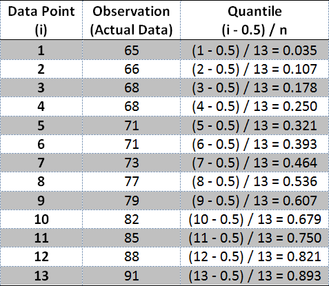
You can then create a scatter plot of the actual data (middle column) against the theoretical or expected value that represents a normal distribution (the Quantile – the 3rd column).
Now on to the analysis portion of the probability plot.
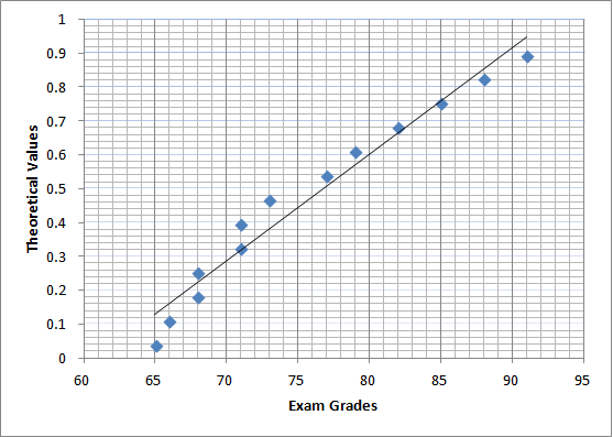
Ok, if our data set was absolutely perfectly normally distributed, the data points would fall on a perfectly straight line.
In general, the closer the data points fit the line, the better the data matches that Distribution type.
This is where the probability plot can become a little subjected.
I might look at the graph above and conclude that the data varies to much from the line and thus the data is not normally distributed. However someone else might come along and think that it’s a decently close match, and conclude the opposite.
A more reliable approach to confirming normality would be a goodness of fit test, which we will cover in future chapter.
The other non-normal distributions require a different approach for their probability plots, and won’t be covered here.
Similar to the normal distributions, the non-normal distribution probability plots can be easily created by statistical software programs. You just simply have to know how to interpret these plots.
The interpretation of these non-normal plots is identical to the normal probability plots. If the data basically falls along a straight line, then the data matches the distribution that you’re evaluating against.
Conclusion
Before you jump into the practice quiz, let’s review what we’ve covered.
The first section was an intro to Descriptive & Inferential Statistics along with the key differences between them.
We wrapped up this first section by discussing the major assumptions associated with Inferential Statistics, along with the concept of Robustness within statistics.
The second section of the chapter was all about Descriptive statistics.
Within this section we discuss the idea of Central Tendency and its three common measures – Mean, Median & Mode.
We then moved onto the concept of Dispersion and its three common measures – Range, Variance & Standard Deviation.
Within this section we also touched on the difference between Populations & Samples, while briefly covering the relationship between differential & inferential statistics, and the concepts of a Statistic versus a Parameter.
From here we will move on to the central limit theorem which allows us to utilize many of the inferential statistics tools that require normality on samples from a distribution that is not normal.
We then moved onto the construction, application & interpretation of frequency distributions & the shape of distribution which again are foundational concept within statistics.
The second section of this chapter was all about Graphical Methods, which can be used to depict relationships or depict distributions.
The two tools commonly used to depict relationships include the Stem & Leaf Plot, and the Box & Whisker Plot.
The tool commonly used to depict distributions is the Probability Plot which can be used for both Normal Distributions & Non-Normal Distributions.
In this second section we covered the construction, application & interpretation of these graphical tools.
