“A man and his tools make a man and his trade” – Vita Sackville-West
As a Quality Engineer one of the most important skills you need is the ability to solve a problem or improve a process.
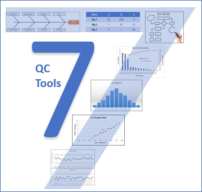
To do this successfully, you need the proper tools. In fact, there are 7 specific tool that you must know.
Kaoru Ishikawa once said “As much as 95% of quality problems can be solved with seven fundamental quantitative tools”.
These tools were first categorized as Quality Control Tools by Ishikawa in his book Introduction to Quality Control.
Does it seem odd that we’re in the Continuous Improvement section talking about Quality Control & Problem Solving?
It shouldn’t – problem solving is continuous improvement.
Improvements happen when we solve problems.
So, what are these 7 fundamental tools for problem solving & continuous improvement:
- Flow Charts
- Check Sheets
- Pareto Charts
- Cause & Effect Diagrams
- Control Charts
- Scatter Diagrams
- Histograms
Within this chapter, we will discuss when to use each tool along with how to construct and analyze them.
So why are these seven tools so effective?
They all share two characteristics that make them very effective in problem solving (and continuous improvement).
First – they are all visual tools. You’ve heard the saying – a picture is worth a thousand words. These tools prove that point.

Second – they all deal with facts or data, not opinions or conjecture.
Problems are solved with facts and data.
Improvements are made with facts and data.
When we combine a fact-based approach with a visual tool we are able to solve problems more easily.
The other comment I’ll make about these tools is that they are often used in combination with each other, and I’ll provide examples of that as we go through each tool.
Lastly, I wanted to provide a link to a Youtube Playlist for the 7 QC Tools.
Let’s get started with the flow diagram.
 Flow Charts
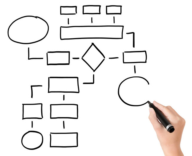
A Flow Chart is a visual tool that depicts the flow or sequence of a process. This can include the flow of information, tasks, people, material or decision.
The Flow Chart’s value lies in its ability to visually communicate the steps and sequence of a process.
The Flow Chart makes the complex become simple, and promotes a common understanding of a process, which is the foundation for improvement.
The Flowchart is an excellent starting point in the Problem-Solving Process, as it allows your problem-solving team to see the entire process and identify improvements.
Flow Charts are also powerful in their application. You can make them super detailed, or you can stay at a high level, depending on the goal of the flow chart.
One common mistake with flow charts is that they are often created in a conference room, away from where the process actually occurs.
There will always be a difference between the “theoretical” process that you believe is occurring, and the actual process that’s occurring.
You must go and see for yourself (Gemba), to truly understand the actual process. Go and talk with the folks who actually work the process to truly understand the process.
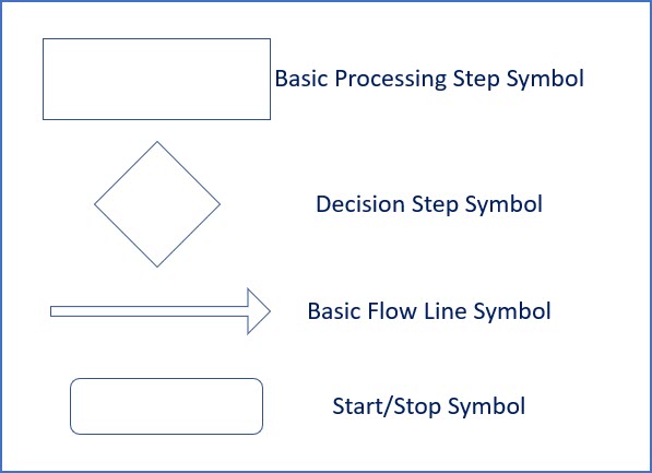
Common Flow Chart Symbols
To facilitate the communication process, it’s generally acceptable to use standard symbols with your flow charts. This will ensure consistency and reduce miss-communication.
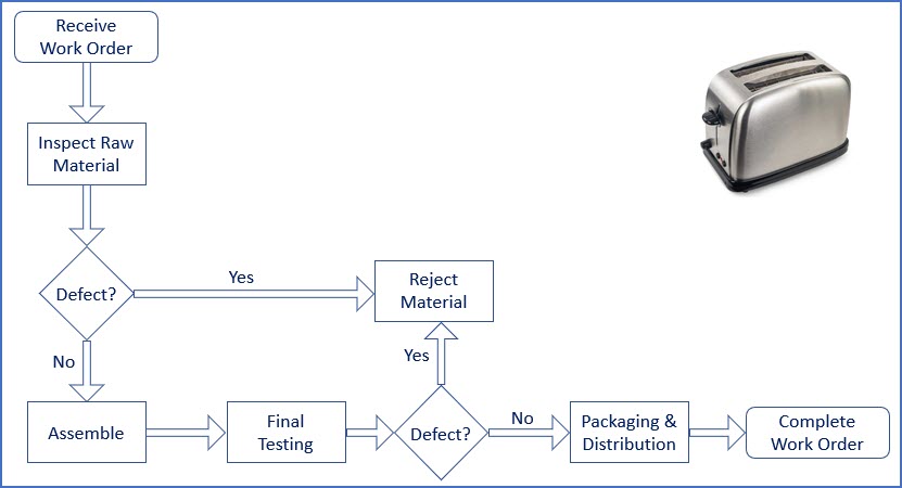
Flow Chart Example
Let’s say we’re a manufacturer of toasters, and we’ve been asked to put together a high-level flow diagram of the entire manufacturing process.
Remember, each of these steps in the process could have its own more detailed flow chart.
Check Sheets
Solving problems and making improvements requires data. Period.
The check sheet is a simple tool for collecting, organizing and analyzing data.
I would argue that when you combine the simplicity of the check sheet with the potential value associated with the collected data that the check sheet is the most powerful QC tool.
A Check Sheet is normally a table with defined rows and columns where the data collected is usually 1 check mark within each category. However, you can modify this concept of a data collection tool to meet a variety of different needs.

The example above is very simply. Almost too simple.
The best check sheets contain something more than data, they contain meta data.
Meta data is data about the data – like who collected the data, when (date, shift or time) the data was collected, and where (location, line, equipment number) there data collection took place.
Without this meta data, the actual data can become ambiguous and lose its integrity (think data integrity).
A good check sheet is designed to have clear, unique & unambiguous data collection categories. If necessary, standard work (work instructions) can be created and distributed with the check sheet to ensure data is collected appropriately.
This can include illustrations to go along with the check sheet.
Let’s say we go back to our toaster example and see what a check sheet for final assembly rejects might look like. This also includes the meta data and illustrations to go along with it.
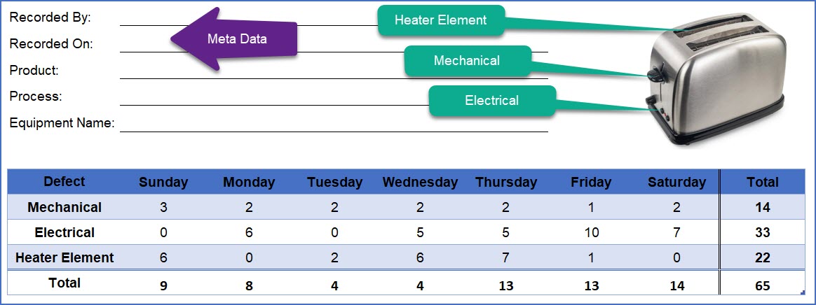
This data can then be fed into a pareto chart to identify the “critical few” defects (Hint, it’s the electrical defect).
 Pareto Charts
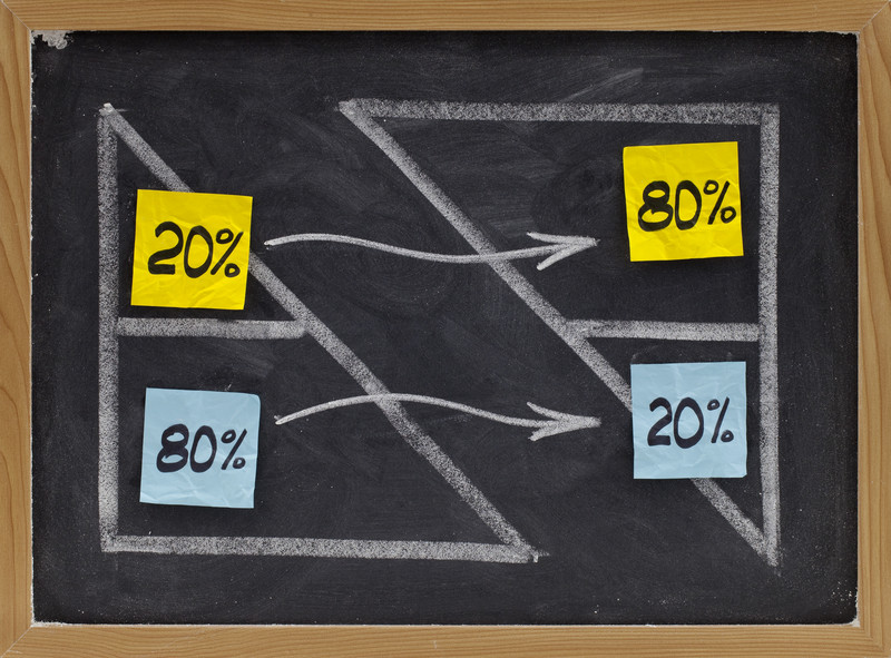
The Pareto Chart is a bar chart that allows for analysis of data in search of the Pareto Principle or the 80/20 rule.
The 80/20 rule was first identified by an Italian researcher, Vilfredo Pareto, who was studying wealth and land ownership in Europe, and found that 80% of the land in Europe was owned by 20% of the population.
What Pareto did not realize is that this 80/20 rule is a universal principle, and can be applied to a lot more than wealth distribution.
The 80/20 rule was popularized by Joseph Juran, who names the Pareto Chart after Vilfredo Pareto.
Juran went on to say that the Pareto Chart helps us separate the vital few from the trivial many.
Essentially, the pareto chart is a prioritization tool that allows us to focus on the issues that are causing the biggest problem, and thus maximize our impact.
Mechanically, the Pareto Chart is simply a bar chart that displays data that from various discrete categories. This data might come from a check sheet.
The categories of data are typically arranged from greatest to least on the X-axis.
The Y-axis is a count of defects, but this number can be cost, or any other variable. Pareto Charts also frequently include a cumulative frequency line to assist in the analysis.
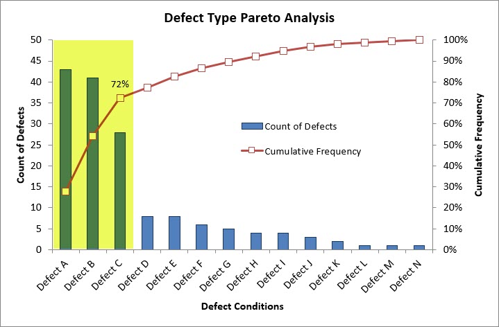
Let’s analyze this our Pareto Chart quickly. There are 15 total defect conditions (A-N).
The top 3 defects (Defects A, B & C) make up only 20% (3 out of 15) of the defect conditions, however they contribute to 72% of the total number defects.
IF we could eliminate just these 3 defect conditions, we could eliminate 72% of the defects.
That’s the Pareto Chart and the 80/20 Rule at work.
 Cause & Effect Diagrams
The Cause and Effect diagram is a visual tool to explore all the potential factors that may be causing or contributing to a particular problem (effect).
This tool was popularized by Kaoru Ishikawa and allows you to graphically capture all the potential causes of a problem, then select those which require further investigation.
The Cause & Effect Diagram is also commonly referred to as the Fishbone Diagram, the Ishikawa Diagram, Cause & Effect Matrix, C&E Diagram or the C-E Diagram.
The cause and effect diagram can be completed as part of a 3-step process.
Step 1 is to agree on the problem statement, this is the negative “effect” you’re experiencing. This might seem simple, but it’s important to align on the problem statement prior to continuing.
Step 2 is the brainstorming process which is facilitated by the 8M’s of the fishbone process (below), and should be used with a process flow chart and 5-Why technique to truly identify causes, and not simply stop at symptoms.

The Ishikawa diagram has 8 major categories (The 8M’s) that might contribute to your problem which include:
- Man – How do Humans interact with your product/process/equipment and how could that contribute to your problem.
- Machine – What type of equipment or machinery are used in your process and how could a deviation here contribute to your problem.
- Method – What type of process/procedure do you follow and what potential issues might contribute to your problem.
- Materials – What type of material is used and how could any material deviations contribute to your problem.
- Mother Nature – How does the environment interact with your product/process in a way that might contribute to your problem.
- Measurements – What type of measurements and measurement equipment do you use and how might this relate to the problem.
- Management – What are the attitudes, outlooks & priorities of management and how could this be contributing to your problem.
- Maintenance – What type of maintenance/calibration activities are being performed on your machines or measurement equipment that could be contributing to your problem.
Once you’ve brainstormed and created a list of potential causes and contributing factors, you can move on to Step 3.
Step 3 is to prioritize an action plan of investigation steps that will help confirm or exclude the potential causes and factors.
Another underrated characteristic of the Cause & Effect Diagram is its effectiveness as a communication aid. Especially when you’re dealing with a very complex issue.
Let’s go through a quick example
 Cause & Effect Example
Let’s say you’re a Toaster Manufacturer and you received a customer complaint for a toaster that is not toasting.
Step 1 in the Cause and Effect process is to agree on a problem statement: The Toaster is not toasting.
With more data we could refine this problem statement to improve the brainstorming, but for now we will leave it generic.
We can always refine the problem statement as the investigation progresses.
Then we can go through the brainstorming process using the 8M’s to identify potential causes and contributing factors that require further investigation.
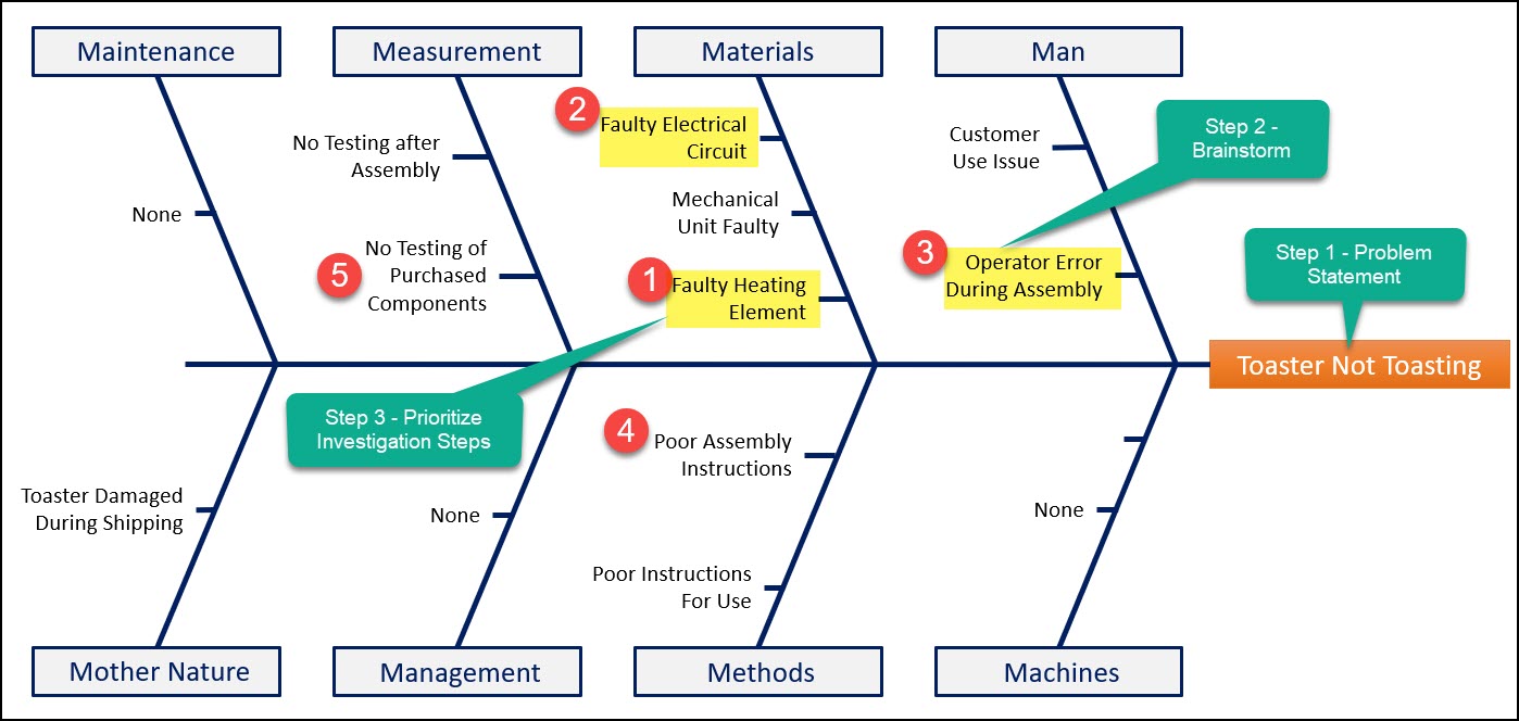
You can see here we’ve excluded maintenance, machines and Management, and identified potential causes and contributing factors in other areas.
We can also prioritize the most likely contributing factors which should give the investigation actions to conclude the root cause of the problem.
For example, we agree that the most likely root cause is a faulty heating element, and we will focus our investigation here first.
 Control Charts
A control chart is a statistically based tool that analyzes the variation of a process.
A control chart is a time-based line graph that reflects the behavior of a process over time including normal variation and any special cause variation.
A control chart can also be described as a visual communication tool that graphs analyzed data in real-time and reflects the stability of a process.
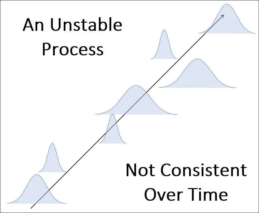
Remember – A good process is a stable process – we want stability.
An unstable process is unpredictable and results in both problems, and is a clear opportunity for improvement.
The details of the control chart, including the various kinds, how to create them, and how to analyze them can be found in the Statistical Process Control chapter.
This section is a high-level summary of the control chart, along with how it can be used to solve problems and improve processes.
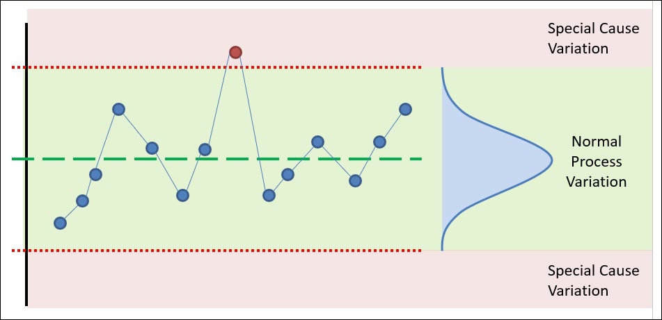
The control chart contains upper and lower control limits that are statistically based, which allow the user to identifying instances where the process appears to be behaving abnormally.
These control limits and centerline represent the “voice of the process” and are simply a reflection of the process – both the average value of your process and the natural variation of the process.
The primary benefit of a control chart is its unique ability to separate the normal variation within your process from the special cause variation.
Special cause variation causes problems. It represents an opportunity for improvement.
Normal cause variation can also be an opportunity for improvement, however reducing normal cause variation can be difficult because it can often require making substantial changes to the process itself.
Using control charts allows you to proactively monitor your process, detect when a problem is occurring (or has occurred), which is the starting point for an improvement project.
A control chart is like a scoreboard. It can be used at the end of an improvement project to indicate if an improvement was successful or not.
 Scatter Diagrams
A Scatter diagram is a visual analysis tool that is meant to reflect the possible relationship between two variables.
The Scatter Plot visually plots pairs of data on an X-Y graph in order to reveal the relationship between the data sets.
This section will summarize the scatter diagram at a high level, and the Relationship Between Variables Chapter in Statistics will cover this topic in detail.
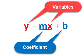
The relationship between the two variables can be positive, negative or non-existent. The strength of the relationship can also be analyzed visually by how closely the points fall on the line of best fit.
The strength of that relationship can be expressed mathematically using the Pearson Correlation Coefficient, which is a number that ranges from a strong positive correlation (+1) to a strong negative correlation (-1).

Scatter Plots require pairs of data, one set of data in the pair is normally referred to as the Independent Variable (X) with the second half of the data set being your observed measurement also known as the Dependent Variable (Y).
When a Positive Correlation exists between two variables a positive increase can be expected from the dependent variable (Y) when the intendent variable (X) increases.
The opposite is true for the Negative correlation. A negative correlation means that when the independent variable (X) increases, the dependent variable (Y) will decrease.
No Correlation results when the two variables have no measurable effect on each other. That is a change in X, does not impact Y.
The scatter plot is often used in the problem-solving process when we’re studying a process to understand which input variables (independent variables) are contributing to a negative outcome in a response variable (dependent variable).
This chart is fairly easy to create using tools like excel or other statistical analysis packages, we can collect data using a check sheet, and we’re specifically collecting paired data.
Let’s take a look at an example of how we could use a scatter diagram to analyze two variables and assess the relationship between them.
 Scatter Diagram Example
FYI – below is a hypothetical situation. I’ve created this data as an example, however I believe the conclusions are likely accurate 😊.
Let’s say that I’m studying the various factors that affect performance on the CQE Exam.
I hypothesis that there is a relationship between quiz scores and the ultimate exam score.
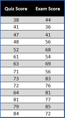
So I run an experiment where I work with 14 people and have them take a quiz before the exam to determine if a relationship exists between these two variables.
Ultimately, I’d like to be able to predict their exam score based on the quiz score.
So I’ve taken these pairs of data, with the Quiz Score as the Independent Variable (X), and the Exam Score as the Dependent Variable and analyzed them using a Scatter Diagram.
Each pair of data represents a dot on the Scatter Plot, and I’ve included a linear regression line to reflect the relationship between these variables.
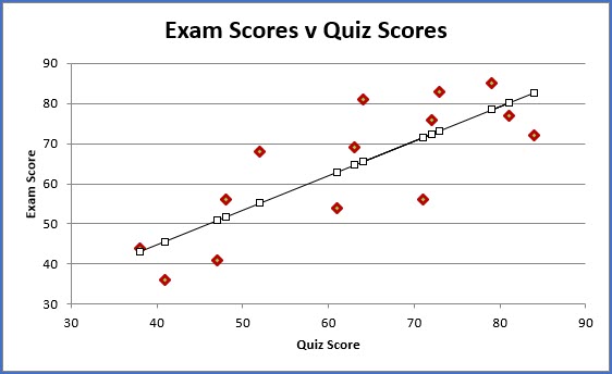
This scatter diagram indicates that a strong positive correlation exists between these two variables (r = 0.8).
If you do well on the quiz, you’re likely going to do well on the exam.
But can doing well on a quiz CAUSE you to do well on the exam. No.
This is a good opportunity to warn you about the difference between correlation and causation.
This is an example of correlation without causation.
These two variables highly correlate with each other because there are other factors like study time, study habits, or job performance that are CAUSING you to do well on both variables.
So, if you really want to do well on the exam, create healthy study habits, invest your time to study, reflect on what you’ve learned, put that into action and you will do well on the exam (and the quiz).
It’s not to say that this quiz is without value though. The quiz is an indicator of potential success on the exam.
You might have indicators like this in your process that perhaps do not relate back to quality or cost, but they can indicate if a problem exists.
Histogram
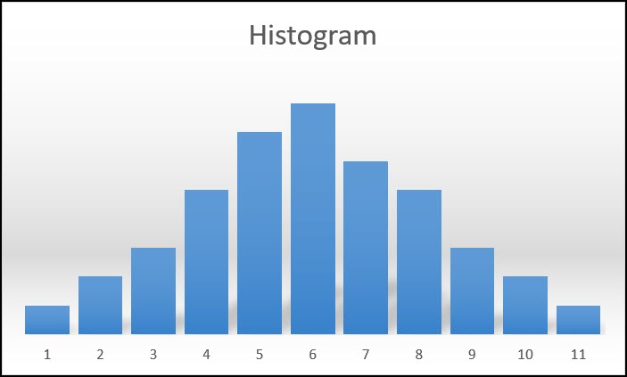
The Histogram is a tool used to visualize the distribution of continuous data.
More specifically, a Histogram is a type of Bar Chart that graphs the frequency of occurrence of continuous data and is a useful tool for displaying, summarizing and analyzing data.
Variation is all around us.
Every process or product has some level of variation.
Every data set you collect will have variation in it, and this variation will exist in a “Pattern”.
And the best way to see or understand this Pattern of variation is to graph your data using a Histogram.
There are different patterns of variation that may be revealed in a Histogram. The most common distributions, and their analysis, are discussed within the Probability Distribution section of Statistics, and 3 examples are shown below.
Typically, a distribution can be characterized by the central tendency of the data (Mean, Median Mode), and the “variation” (range, standard deviation, etc) within the data.

Within the next section on Statistics, you’ll learn that many concepts and tools assume that data is normally distributed.
The histogram is a visual tool you can use as a gut check to see if your data set is approximately normal.
Lastly, in terms of creating a histogram, this can be done in excel, and many statistical software packages will create histograms for you, so I won’t go into that detail here.
 Conclusion
As a Quality Engineer one of the most important skills you can have, is the ability to solve a problem or improve a process.
To do this successfully, you need to be able to apply the 7 QC Tools.
These 7 tools combine a fact-based approach with a visual tool that makes solving problems easier.
Below is a quick and simple review of the definition for each of the 7 tools discussed within this chapter.
A Flow Chart is a visual tool that depicts the flow or sequence of a process. This can include the flow of information, tasks, people, parts, material, etc.
The check sheet is a simple tool for collecting, organizing and analyzing data.
The Pareto Chart is a bar chart that allows for analysis of data in search of the Pareto Principle or the 80/20 rule.
The Cause and Effect diagram is a visual tool to explore all the potential factors that may be causing or contributing to a particular problem (effect).
A control chart is a time-based line graph that reflects the behavior of a process over time including normal variation and any special cause variation.
A Scatter diagram is a visual analysis tool that is meant to reflect the possible relationship between two variables.
A Histogram is a type of Bar Chart that graphs the frequency of occurrence of continuous data and is a useful tool for displaying, summarizing and analyzing data.